Tuesday, March 23, 2010

I Am The LAW! (Commissar WIP)

Sorry to disappoint the Judge Dredd fans out there, this has nothing to do with 2000 AD. Although from what I've heard, compared to the comics, the movie was disappointment enough (even though I quite liked it - don't tell anyone I said that!).

Well this wasn't what I had planned to post next, but I've been pretty pleased with my results so far from my first Commissar for this army. I wanted to spend a bit more time on him than usual, as he will stand out from the rest of the army due to his distinctive black and red.

So far I've finished the flesh and the chest plate - the coat and rest of the clothes are still WIP. Completely lacking in originality, I decided to try and paint him up just like the GW version. The only change I made was to paint the gems purple instead of blue, to tie in with the purple plasma coils etc. that will come later.

If you read my post about painting faces using layering (I know there's one of you out there somewhere...) you'll recall the outcome of my previous attempts. Which is to say, not good. I thought I'd tackle it again, because like they say - "there's always the chance that you'll get better at painting faces. One day."

Well, perhaps they don't say that, but, damn it, it's a motto I live by!

Not brave enough to go it alone, however, I used the GW masterclass, published on their website, looking at the AoBR Space Marine Captain. Once I realised that their photo apparently bore very little resemblance to the colours in real life, I added a tiny bit of blue in the last couple of layers to give a pallid tone to the flesh. I probably should have done this with the bottom layers too, but I'm still happy with how it turned out. If I can remember correctly, the flesh went as follows:

1. Basecoat with 50:50 Dark Flesh and Tallarn Flesh.
2. Highlight with Tallarn Flesh.
3. Wash with Ogryn Flesh.
4. Highlight again with Tallarn Flesh.
5. Further highlight with 50:50 Tallarn Flesh and Dheneb Stone, plus a pinch of Regal Blue to taste. Not that I eat paint...
6. Final highlight of Dheneb Stone, with a little Regal Blue again. Again, only use a little bit - you don't want him looking like a Smurf.
7. The eyes were done my usual way - that is, paint a black line where the eyes are, fumble around for a while trying to put a couple of dots in the corners of the eyes and end up having to redo them about 5 times before I'm happy with them. Hopefully it becomes easier...

Anyway, here's the result: (Sorry the white balance is off. I tried to correct for it but couldn't manage it tonight).


The chest plate was done with the following:

1. Boltgun Metal basecoat.
2. Badab Black wash.
3. More Boltgun Metal on the central areas of the chestplate, leaving the recessed areas a bit darker.
4. Mithril Silver highlights for the edges and rivets.
5. The aquila and fern leaves were given a 50:50 Scorched Brown and Shining Silver basecoat.
6. Highlight with Shining Gold.
7. Wash with Gryphonne Sepia.
8. Highlight with 50:50 Shining Gold and Mithril Silver.
9. Extreme edge highlight with roughly 70:30 Mithril Silver and Shining Gold.

The gems were done using Liche Purple mixed with varying amounts of black and white to give some shading.

That's about it so far! In looking at other people's takes on this model on coolminiornot.com I was a bit depressed to see that their Commissars were much nicer than mine - I guess I've got to keep reminding myself that a lot of those models are done as display pieces!

I'm hoping to have the finished model up soon, so keep an eye out!


UPDATE: I've put some better photos up top, but kept the old one here for posterity...

Wednesday, March 17, 2010

Wet Wet Wet. (The Palette, not the Band)

Today I'm going to talk briefly about using a wet palette when painting. I was getting frustrated at my paints drying while still on the palette previously, and they were also drying out quickly while on my brush. (A 45 degree Celcius heat wave is not an ideal evironment for painting...)

In my searching across the internet, I heard of a mysterious thing called a 'wet palette'. I tracked down some info on how to do it, and it has made painting much easier and more enjoyable.

While they can be bought, I'll show you how to make one for less than $10 Australian.

You'll need the following:
  • A flat, shallow container of an appropriate size (basically, big enough for you to use as a palette). I got mine from the local cheap store for $2.
  • Some paper towel/kitchen wipes.
  • Baking paper - this has to be porous, so the waxed type won't work.
  • Water.
That's it! The following steps put it all together:


Here's the container I use:


Line the bottom of the container with your paper towel/cleaning cloth. The idea of this is to absorb the water so it isn't sloshing about in the bottom of your container:


Now pour some water in so your padding at the bottom becomes completely soaked, but there isn't excess water:


Now grab your baking paper and cut it to size to fit in your container:


Pop the baking paper in and press down - you should feel it become 'damp' as the water starts to come through:


And that's it! Use it just like you would with a normal palette, but you should find your paints take a lot longer to dry out than before, meaning less wastage! Keep in mind that you only need to add a little bit of water from a jar using your brush when using these paints - they will thin down somewhat just from sitting on the palette.

It also means that if you mix paints, they'll last longer and save you from trying to reproduce colours.

One thing I find is that, for some colours, if they are left overnight the pigment will separate from the carrier liquid and will require a bit of mixing up again to restore to normal. Not a big deal though!

P.S. - for those who are interested, the wet palette works by attempting to maintain an equilibrium of water on both sides of the baking paper. As the paint dries out, it draws water through the baking paper to rehydrate itself.

So there you go - educational AND useful. Who says the two don't go together?

Wednesday, March 10, 2010

It's a Lot to Weather... (Painters' Help Needed Please!)

Bad puns aside, I've got some new work to show you! (Up until now, the stuff you've seen is quite old).

I haven't picked up a paintbrush for a while, so I've gotten back into it over the last few days. I'll show you some more substantial results later, but for now here's my first foray into weathering.

If you've read the background material for my army here, you'll know that my guardsmen are supposed to be a tough, battle-hardened force. To represent this on my models, I want to have used-looking armour and equipment.

I've gone for the technique of using a sponge to dab on spots of colour to represent the paint chipping off. I need to do it for all my troops so I need a quick but good-looking method.

Firstly, here's what I've done. Note that the rest of the trooper was already painted, I've just tested the method out on this shoulderpad:


To do it, I've done the following:

1. Basecoat with Necron Abyss.
2. Paint a grey stripe of Adeptus Battlegrey.
3. Using a small bit of foam (taken from Citadel movement trays), sponge some Necron Abyss over the grey stripe to make it look as if it has worn through to the layer beneath.
4. Using Calthan Brown, repeat the sponging technique.
5. The sponging technique gives lots of little spots which, in my opinion, make it look too messy. I went back and painted over some of the small spots with Necron Abyss or Adeptus Battlegrey, depending on where they were, to 'repair' these small chips.
6. Using a fine brush and Skull White, underline some of the larger chips.
7. Again with the fine brush but now with Scorched Brown, paint a thin line at the top of the bigger chips. Steps 6 and 7 are meant to give an illusion of depth, but I haven't quite gotten there yet.
8. This time, I went back and painted a 77 symbol but purposely doing it broken so it looked chipped, but in future this would be done after step 2. Note that I'm not sure this symbol will be a 77, but I wanted something to go there on the test model and I haven't yet come up with a symbol that I can freehand consistently.

So please let me know what you think!

From any readers who have used this method before, I'd love some hints and tips to improve my work. Please leave any and all advice in the comments!

As always, thanks for reading and stay tuned!

Thursday, March 4, 2010

Guardsmen Conversions

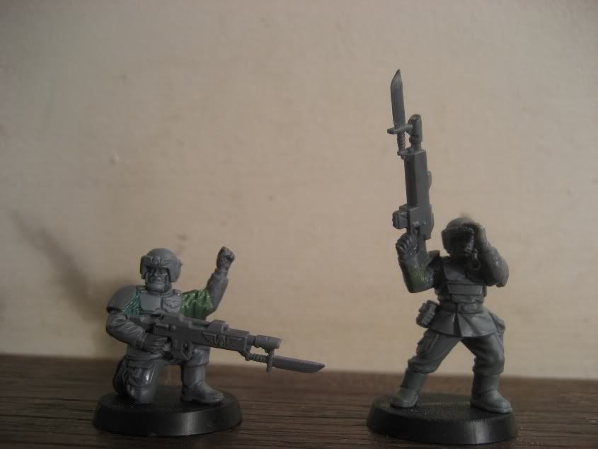
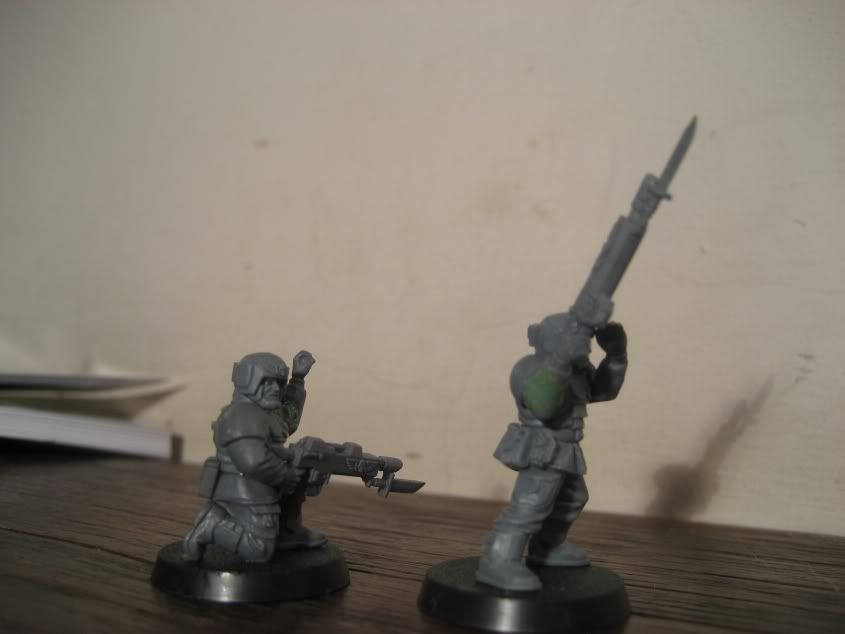
Just a quick update - I'm still working away on various projects, but for now, here's a couple of conversions! I want to avoid having a whole army of troops who look the same, so every now and then I try and pop in a small conversion to add some variety. These are two examples:


Not too much to say about them, except that they were before I got my new tools that I use for Green Stuff work (more to come later!), so I'm not completely happy with it. Unless you look closely, however, they don't look too bad.

As always, thanks for looking!